Whether you are looking to create a dramatic, luxe kitchen, or a sleek, contemporary space for your customer, dark blue is a timeless, versatile trend that seems set to be around for a very long time.
With our palette of blues constantly evolving, we wanted to take the time to explore one of our most popular hues; Hartforth Blue, a shade that works perfectly on its own or combined with a lighter shade for a balanced two-tone look.
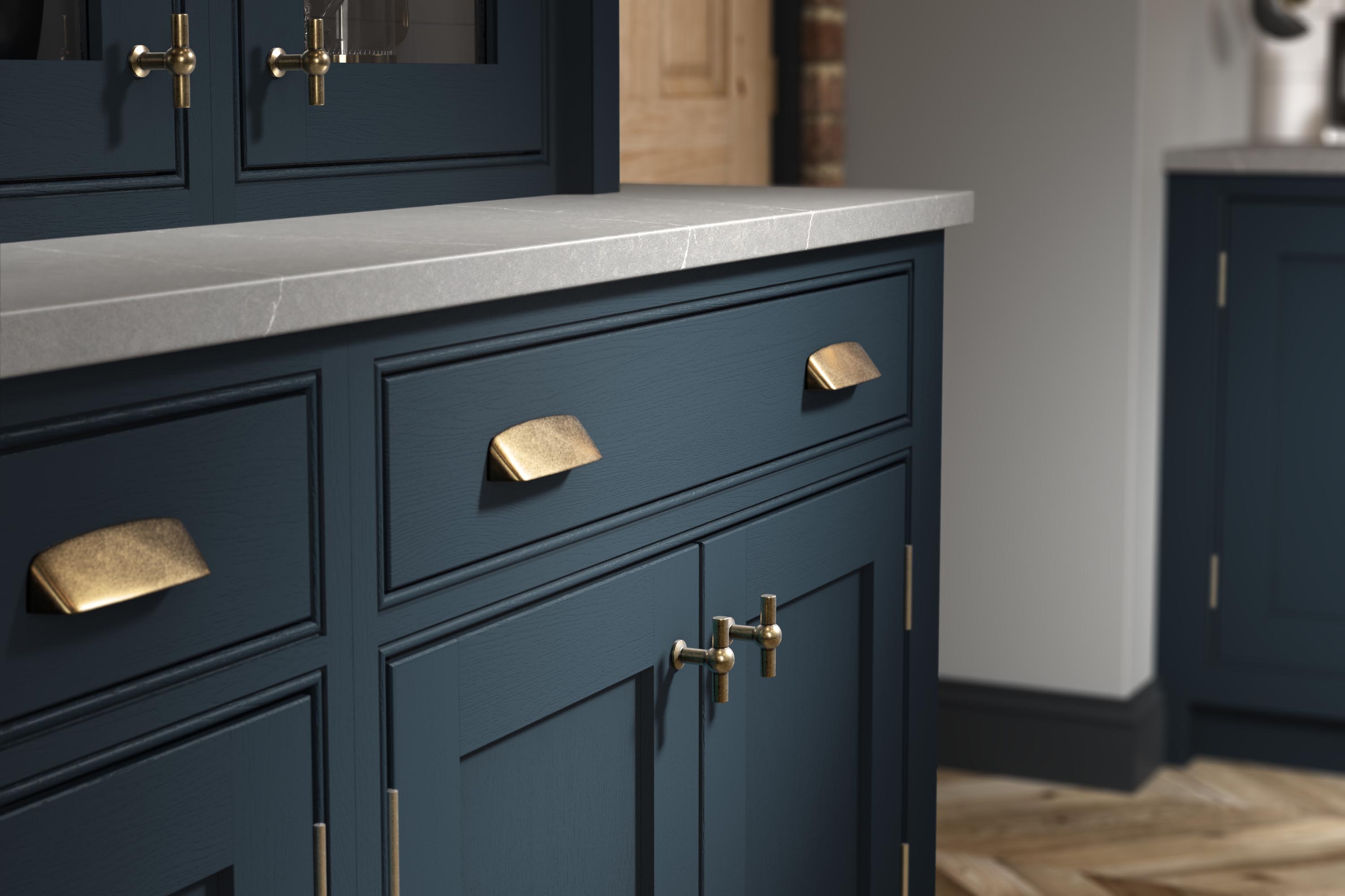
Hartforth Blue was introduced to our extensive paint palette in 2015, to conquer the demand for colour. With the industry desperate for a striking blue, the hue was picked for its distinct ‘blue blue’ nature – not too dark that it could be mistaken for carbon or black, and not too warm that it could give away hints of green; it was a perfect balance to combine with an array of finishes. Six years on and with shows like The Crown and Bridgerton becoming increasingly popular throughout lockdown, painted blues have once again taken centre stage to satisfy the appetite of Edwardian and Regal influences.
“This quintessential shade is synonymous with period attributes, however the beauty of Hartforth blue is it can work brilliantly within a classical design or it can be brought into the 21st century, depending on the variants around it.”
Lizzie Beesley, Head of Strategic Design, PWS